Mondly - UX/UI Dashboard Design for Language Learning Platform

Cultivating Knowledge with a Smart Dashboard
Continuing our exploration of the Mondly language learning platform, Outcrowd is excited to reveal the user-friendly dashboard. But first, don't forget to check the first part of this project - branding.
Rich with Functionality
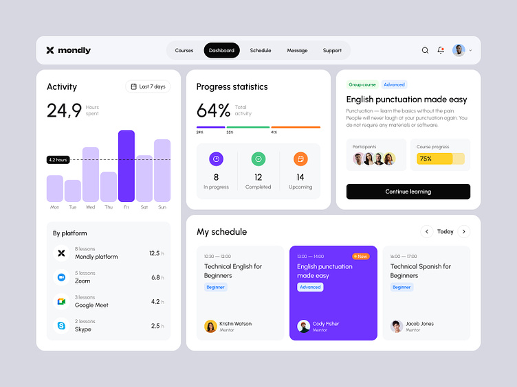
The Mondly dashboard is designed to be an intuitive command center for your language learning journey. Just like a blossoming flower, the dashboard unfolds to reveal a wealth of features, all presented in a clean and organized layout.
At a Glance:
Progress Tracking: Monitor your progress with clear visuals and informative metrics, helping you stay motivated and celebrate your achievements.
Personalized Learning Path: Your personalized learning path is front and center, guiding you toward fluency with targeted lessons and exercises.
Gamification Elements: Playful features like points, badges, and leaderboards keep you engaged and add a touch of fun to learning.
Seamless Integration: The dashboard seamlessly integrates with other parts of the Mondly platform, providing a unified learning experience.
A Harmonious Blend of Creativity and Functionality
The visual design echoes Mondly's overall branding, incorporating a vibrant color palette and minimalist flower motif. This cohesive approach creates a positive and engaging atmosphere that motivates users to keep learning and growing.
Stay tuned for more on Mondly! We'll be showcasing the website design next.
=================
hello@outcrowd.io
🌐 outcrowd.io
Make sure your brand image won't get lost in the market noise.
With design and branding, Outcrowd helps to reveal the essence of your brand and transform it into a powerful force that excels in results.
Become a part of Outcrowd communities:


