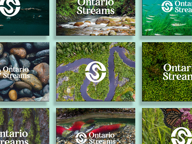
Ontario Streams

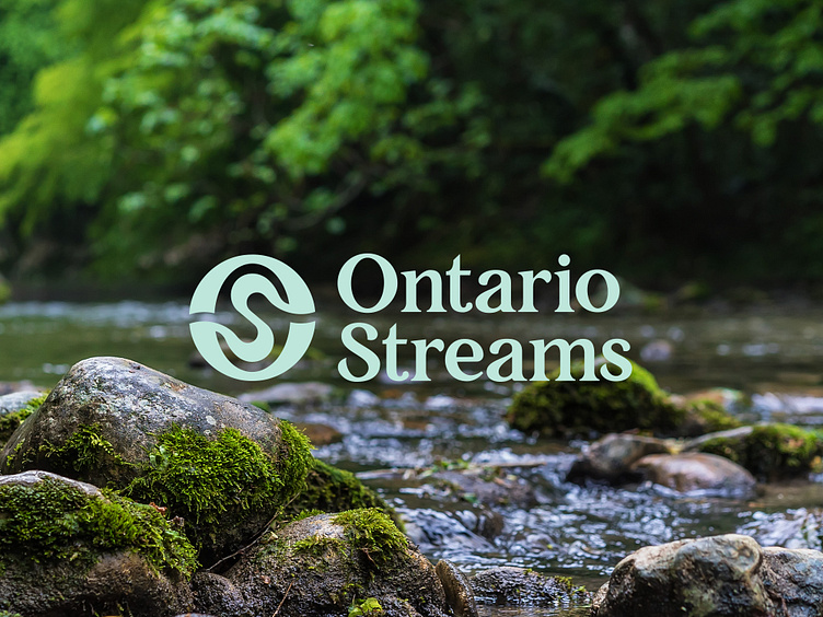
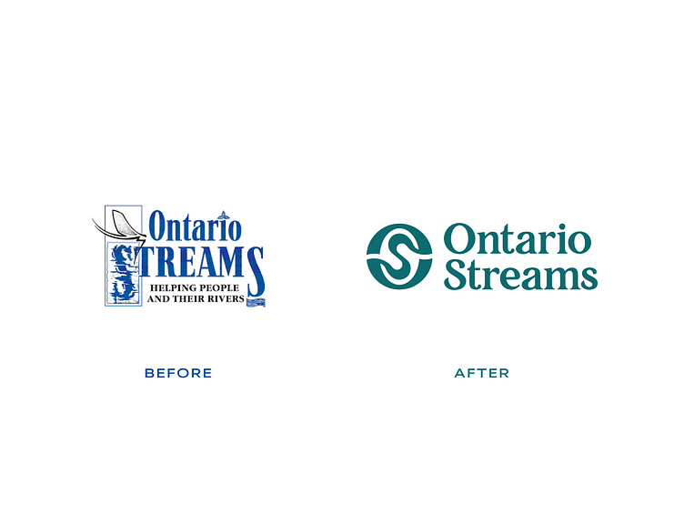
Since 1995, Ontario Streams has maintained the same logo over the years, with one minor change occurring early on to change our slogan from “Friends of the Resource” to “Helping People and Their Rivers” to better reflect their mission. During their strategic planning process in the summer and fall of 2022, an idea blossomed around starting our next chapter with a rebrand of the logo. Over the years, Ontario Streams experienced challenges with their logo including scaling, legibility, and incompatibility for various uses. I came in to solve those issues, but also help this amazing non-profit stand out amongst their partners as well as resonate with their community.
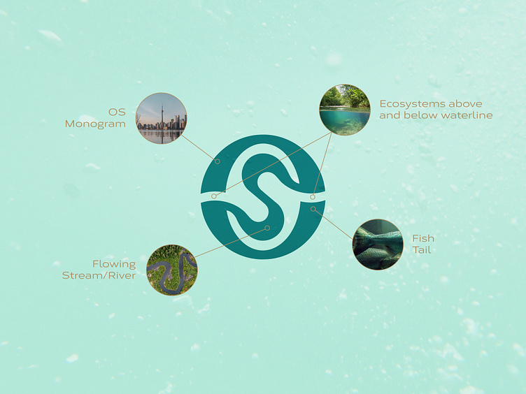
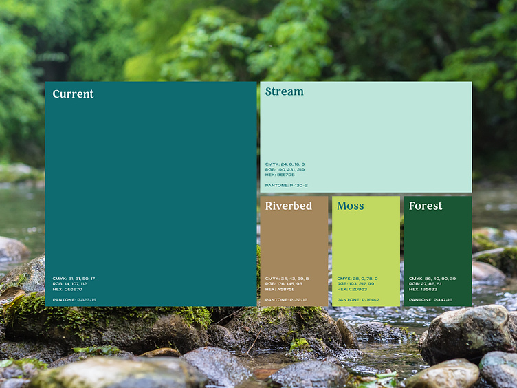
As I worked with the Ontario Stream's staff, we knew we wanted to prioritize their organizational values of community-based, grassroots and reliability captured in their new identity. Some of our early inspiration came from vintage field notes and halftone effects to create relay the grassroots nature of Ontario Stream's work. I made special note that Ontario Streams' work is as diverse as the environment that they are working tirelessly to protect.
Over several months, I provided insight towards Ontario Streams rebrand and prioritized that their new identity maintains their values. I gathered feedback from Ontario Streams staff and board of directors to better understand our wants and needs for a new logo. Early in our design discussions, the concept of a monogram was an intriguing idea, also for certain applications, Ontario Streams utilized an "OS" mark that derived from their original logo. We also liked this approach because none of their allies/partner organizations utilized a monogram form for their logo.
Full case study: https://www.behance.net/gallery/169435131/Ontario-Streams