Ontario Streams


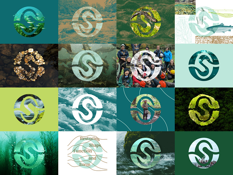
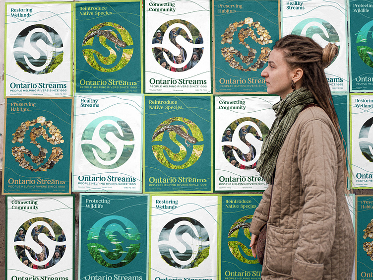
While I was creating the new identity for Ontario Streams, I wanted the logo to have the ability to act as a “window” into an Ontario river/stream/forest/wetland. Ontario Streams’ work is so diverse, and I wanted to compliment that with a logo that can change to whatever story they are wanting to tell. For instance, if they wanted to focus on a campaign about Jefferson Salamanders, they have the ability to crop in a photo or overlay a cutout on the logo while maintaining the overall silhouette of the logo and reinforcing their brand. Because of the simplicity of the logo, it has amazing flexibility to adjust to whatever campaign or story they want to tell.
Full case study: https://www.behance.net/gallery/169435131/Ontario-Streams