Thunder Raven Graphics logo

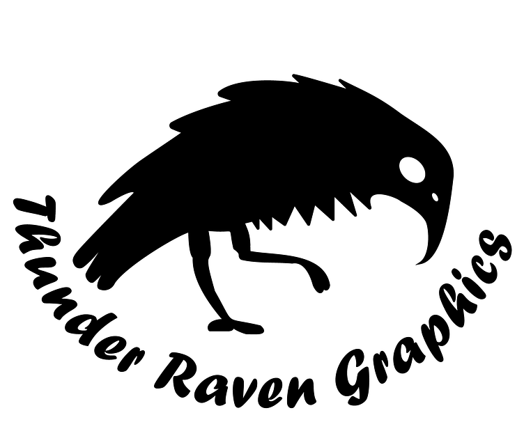
This new logo revision for my branding, Thunder Raven Graphics, is the fourth revision of the initial logo I created in 2018. For this iteration of the logo, I wanted to convey both my capabilities as a graphic designer and my writing skills. I also wanted to clean up Thunder's, my mascot, look up to make his feathers on his back and tail reflect the roundness of the text on the bottom, and give him a nostril near his beak to make the head part of him more obvious. The spikier-looking feathers on the bottom part of him were a choice made to differentiate him from other bird-like logos and I tried to mimic an image of a raven I saw preparing to caw with its feathers puffed out.
As for the font choice, I wanted to go for a more playful typeface that reflects my creativity in book cover design and writing. I discovered that my new laptop I got had the typeface 'Forte' bundled with it. After experimenting with a few others, I thought it would be the best fit for me as a designer and aspiring writer. It resembles a handwritten quality that was done with a pen with thick line strokes.


