Logo creation - INCARRO: transportation & auto area

Hi community👋
I’d like to share my process of creation the logo design for INCARRO.
About:
INCARRO is a company in the transportation sector that owns multiple businesses under one brand. Its subsidiaries include a logistics company with its own Saas platform for AI-powered route planning, and a car rental company. 🚗 🚛
Stage 1: Defining the problem
The objective was to create a logo that could work across all areas of the company: AI-powered logistic software and a car rental company.
Stage 2: Market analysis and mood board creation
After reviewing competitors, we selected a corporate palette of light yellow and black as our primary colors. The vibrant yellow adds a modern touch compared to the traditional red and blue used by competitors. Additionally, I gathered style inspirations and identified the client's preferences.
Stage 3: Concept creation
Afterward, I sketched out ideas and created several concepts inspired by the approved style moodboard.
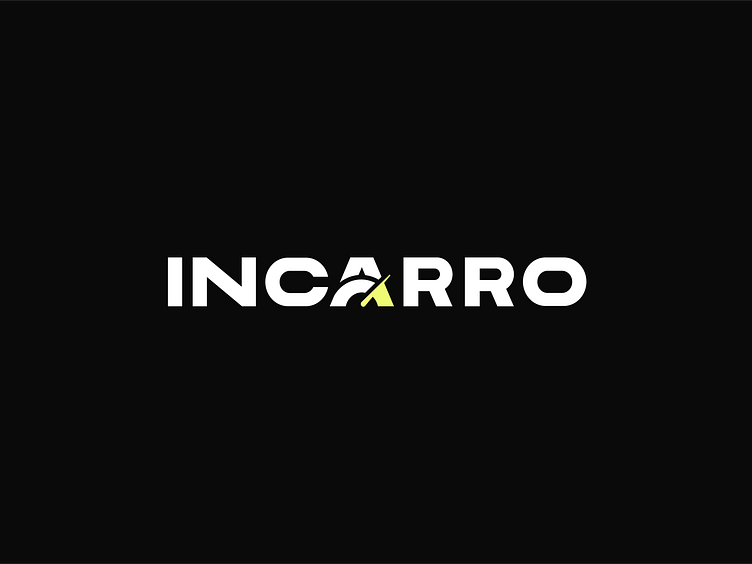
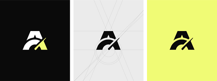
Stage 4: Finalizing the logo
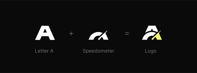
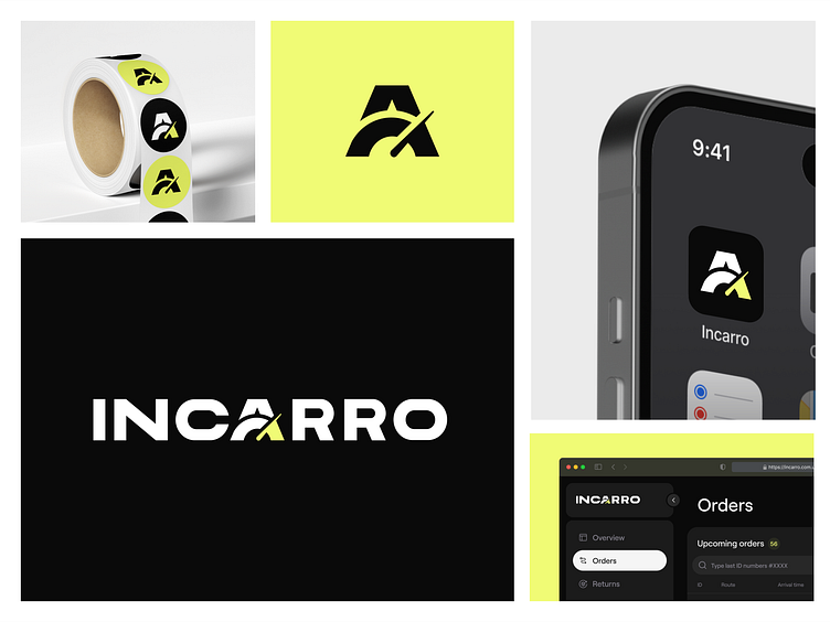
The ultimate concept featured a text logo with a highlighted letter 'A' in the center, also serving as a short form of the logo. The primary image integrated into the logo resembled a speedometer. This choice was twofold: it clearly linked to the auto industry and evoked a positive subconscious association with speed.
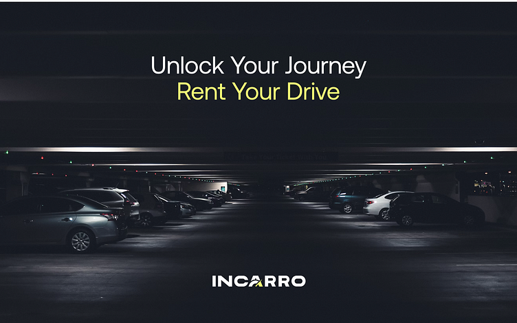
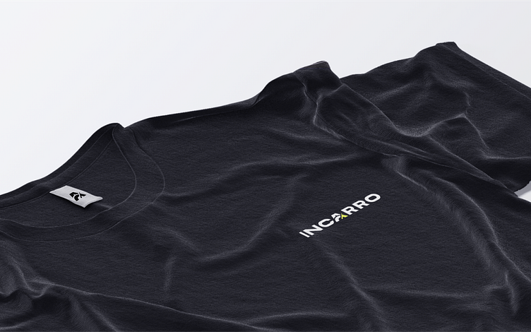
Stage 5: Preparing Additional media & Source files
Once the final version was approved, I compiled a zip folder containing various logo formats required for both web and print purposes.