Fundex - Dashboard widget design for the crypto loan platform

Fundex: Unlocking Customization for Power Users
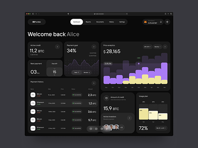
We're back with Fundex! Overwhelmed by the incredible response to the Fundex project (our top performer on Dribbble in March), we're excited to delve deeper into the platform's user experience. Today, we showcase the widget UX/UI design of the Fundex dashboard.
Empowering Advanced Users
While Fundex prioritizes clarity and ease of use for everyone, we understand that some users crave more. For our advanced users, the Fundex dashboard offers a level of customization rarely seen in financial platforms.
Tailored Information at Your Fingertips
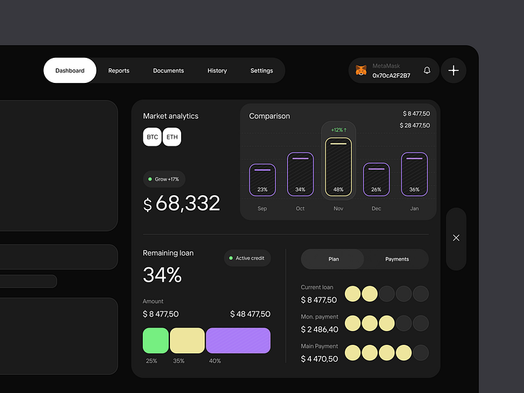
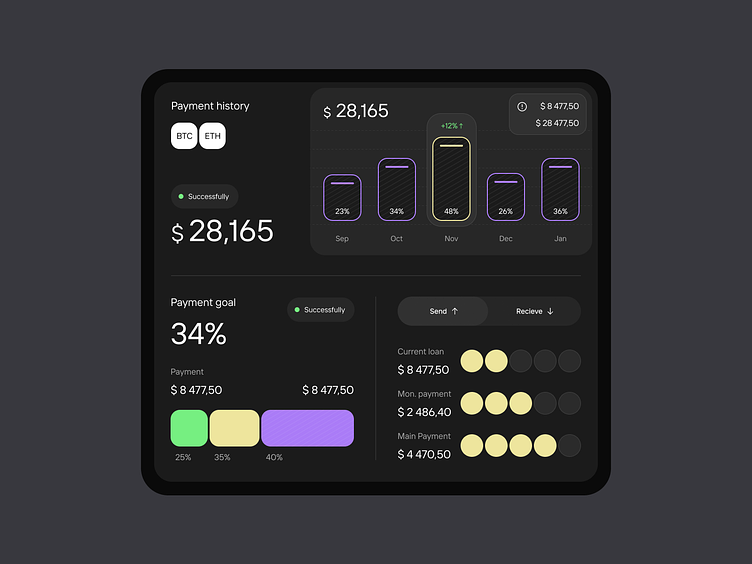
The key lies in our intuitive widget system. These customizable widgets allow users to curate their dashboard experience by displaying the information most relevant to their specific needs.
Scenarios for Success
Imagine a user focused on crypto investments. They can tailor their dashboard to display real-time market data, portfolio performance metrics, and relevant news feeds – all at a glance. This level of personalized information architecture empowers users to make informed decisions with confidence.
Flexibility Meets User Control
The Fundex widget system is more than just data visualization; it's about user control. Users can arrange, resize, and prioritize widgets to create a dashboard that perfectly reflects their workflow and financial goals.
=======================
hello@outcrowd.io
🌐 outcrowd.io
Make sure your brand image won't get lost in the market noise.
With design and branding, Outcrowd helps to reveal the essence of your brand and transform it into a powerful force that excels in results.
Become a part of Outcrowd communities: