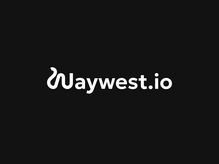
Another perspective on the redesign of the waywest.io logo
Details
Another look at our new logo showcases a harmonious blend of modernity and simplicity. The 'waywest.io' wordmark employs a fluid, sans-serif typeface that is both sleek and approachable.
Its defining feature, the stylized 'W', conveys motion, innovation & movement. The '.io' suffix, presented in a compact format, while the balanced use of white space ensures optimal readability and a clean visual impact.
This logo is designed to be versatile, functioning across various platforms and sizes.
Full case of this project you can find here
Interested in collaborating with Waywest?
Please feel free to reach out:
Our website
Drop us a mail - waywest.io@proton.me
Check our Instagram
Follow us on X
We're not so serious, by the way, so no need for LinkedIn language 🤪


