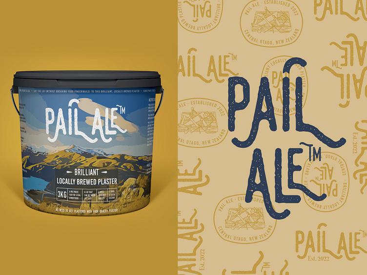
Pail Ale - plaster logo, branding and packaging concept

Another angle of my Pail Ale concept - here you can see a peek at the logotype and the custom icons I created especially for the brand alongside the packaging concept.
This was my fave concept even though it ultimately didn't get selected in the end.
'Pail Ale' is a play on the name of a beer, but applied to their product which is plaster for house building. The design style we agreed on was modern retro, with a fresh humourous side which is a bit tongue in cheek.
The plaster is produced locally in Central Otago, New Zealand, and this is what I based this particular packaging and branding concept on.
The custom illustration in the background is done based on a Lake Dustan view, and all design elements of the pail are leading back to the star of the show - the locally made plaster, perfect for the local conditions.
Want to start a project? Feel free to contact me at victoria.b.georgieva@gmail.com


