Clickl - Social Media

🔗 Link to Case Study
Press ❤️ and check out Behance version
We’ve split communication types for Clickl – why and how?
Our Head of Design – Maria Brilkova answers.
In fact, the difference doesn’t have to be big, but it may be needed to ensure efficient communication and one of our latest projects is a prime example.
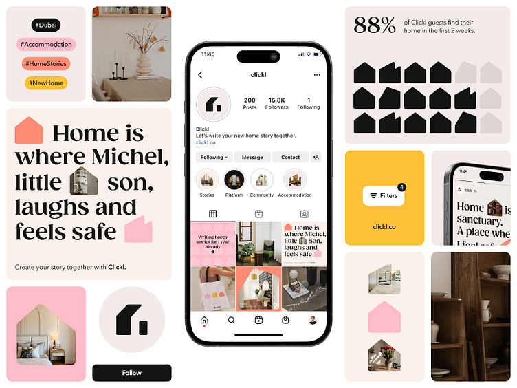
Clickl redefines the home search in Dubai, making it personal and effective (thanks to AI). But their mission is no less important and the brand communication is the perfect way to translate it to “Guests” – the part of the audience that’s supposed to look for a property.
But property search doesn’t work without houses, and this is where “Agents” come into play. They have different goals and motivators and Clickl just has to keep it in mind.
There are lots of ways how to set visual communication apart, and from all them, we chose Color and Tone of Voice.
Color works great as an instant tool and allows for fast connotations. And Tone of Voice supports this concept by influencing the deeper levels of consciousness.
The main rule for the Color treatment is: warm for “Guests” and cold for “Agents”.
We decided to keep nice little house shapes for “Agents” materials to not let Clickl lose the soul. So using a cold neutral palette for balance sounded like a good solution.
We tested this idea when creating presentations and social media materials aimed at Agents, using other visual techniques available but adhering to the cold neutral palette. And it worked out really well.
There were no concerns about Guests-aimed communication because not only we had warm neutrals, Guests palette had also bright accents that made the design pleasant and inviting.
The main challenge with the Tone of Voice was maintaining a consistent personality. We wanted to avoid unnecessary contrast and ensure Clickl didn’t act differently with different audiences.
You may know the struggles of introducing two friends groups to each other so having one personality for all of them might be a good idea. It’s not that we relied on this heavily, but people and companies can really have similar problems sometimes.
Clickl focuses on home as a concept instead of talking about property or technology itself and we used this in Guests communication and a human&personalized feel. Here we’re telling stories and act as an understanding friend.
Agents communication required something different. Clickl is not ashamed of its friendly identity and it always stays true to itself. However, it employs a more professional and goal-oriented tone in Partners-aimed communication to evoke a sense of professionalism and reliability. Also, personal stories aren’t used in Partners-aimed communication.
Doing this allowed us to have distinct and consistent communication right from the start without making it messy and we encourage you to pay attention to such things when working with brands communication.
🔗 Link to Case Study
Press ❤️ and check out Behance version
Love our work? Have a project?
Let's talk: hello@unikorns.agency
Get to know more about us on our website.
Follow us on Facebook / LinkedIn / Instagram / Behance / Clutch


