Flat and House Share Website Redesign

I've been using SpareRoom platform to find rentals lately. It's a pretty decent tool, but it could use a bit of a makeover as it looks and feels outdated. So, I decided to do a visual redesign exercise - focusing on the Account page.
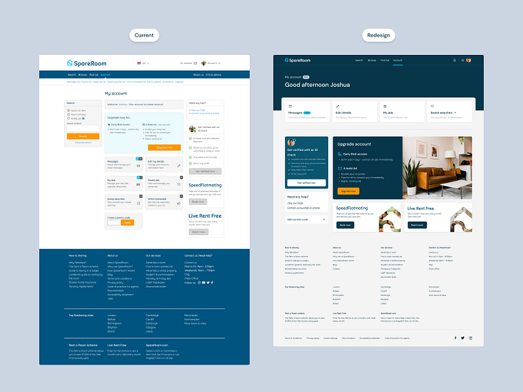
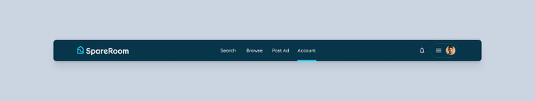
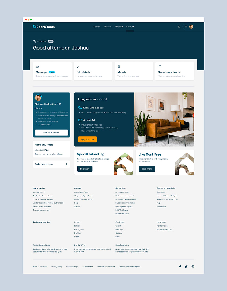
Merged the top header and the navbar into one - displaying only the main four global nav links. Additional links can be housed within the dropdown menu to minimise visual clutter.
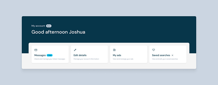
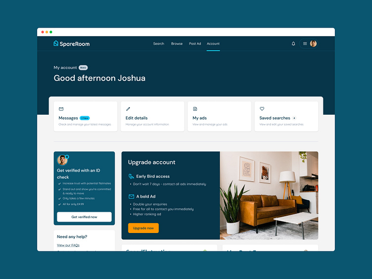
Moved the personalised greeting outside the main content, so it serves as a page header/banner. This can be a consistent pattern across the platform.
Moved the My account links above, away from rest of the content since they're the most important elements users would interact with in their account area. This also allows us to eliminate the sub-navigation.
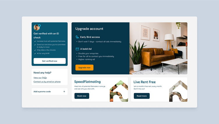
Combined 'Saved Ads' and 'Who's Interested' with 'My Ads' - simplifying user options.
Colour, type and size treatments to add contrast between different components.
Added some relatable imagery from unsplash.com to enhance visual interest and help user understand the brand/product.
I decided to remove the search box because I don't think users would typically use the search box within the account area?
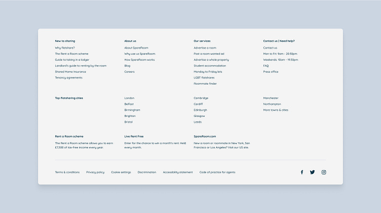
Kept most of the footer as is, with minor cosmetic changes such as removed the background colour, added more white space, and reduced the font sizes.
Let me know your thoughts. Thanks.
Disclaimer: Redesign Work for Practice Purposes Only
This redesign project is solely for practice purposes. Any concepts, designs, or materials produced during this exercise are not intended for commercial use. The aim is to enhance skills, explore techniques, and develop proficiency only. No affiliation with any specific brand, company, or organisation is implied. All rights to any original content used or referenced in this project belong to their respective owners.


