Rebranding and Mailer Box Design

The project aim was to relaunch the brand, convey the company's perspective on sustainable living in relation to high-end children's clothing, and establish a connection with modern parents through the final logo, mailer box, and brand identity.
Upon reflection of the incorporated market research findings, it can be concluded that my final designs have successfully fulfilled the client's requirements. The new designs effectively showcase transparency in terms of the production process and emphasize the use of natural materials.
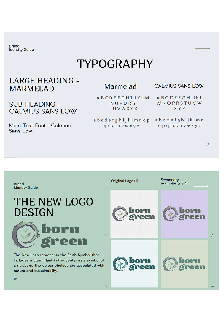
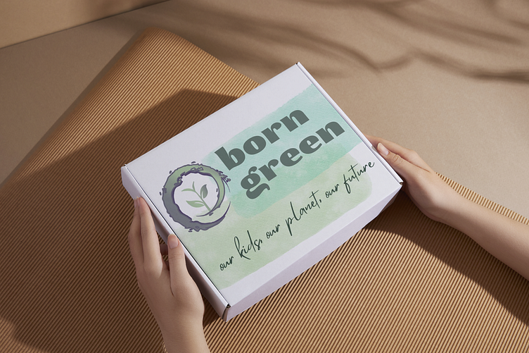
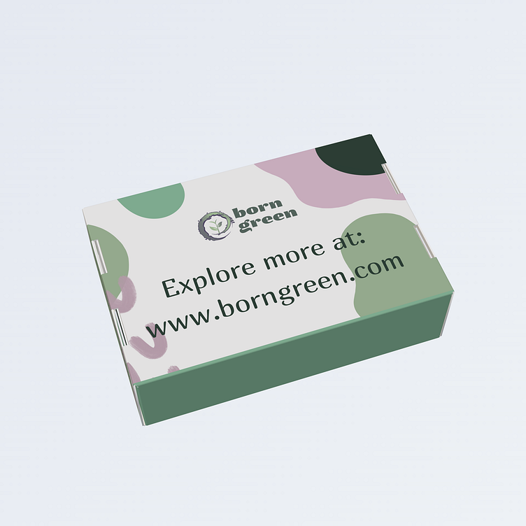
The new logo design incorporates the company's name in a modern and appealing sans-serif font, effectively communicating a sense of high quality. The chosen colors for the logo are also in line with the theme of nature and sustainability. The results of the Market Research Survey indicate that this design is memorable and conveys a sense of luxury.
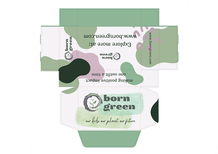
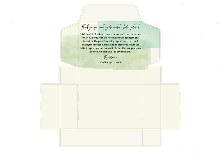
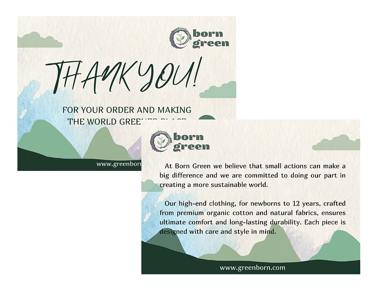
In terms of the mailer box designs, it was crucial for me to ensure that the final graphics and layouts were visually pleasing and consistent with the brand identity. The box and all its contents are made from fully recyclable materials, aligning with the company's commitment to sustainability. The messages and their alignment on the box are designed to evoke positive emotions and create a personalized experience, encouraging customers to return.


Overall, the new brand identity guide is designed to portray the business as a modern, sustainable, and premium children's brand. The colors, typography, imagery, and messages used are all carefully chosen to convey a sense of youthfulness, luxury, and an environmentally conscious perspective.


