W.app branding

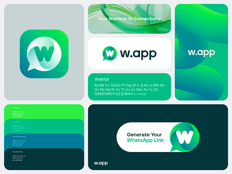
Green is an excellent color for branding, and I'm happy to see that it's gaining more and more popularity recently. I think it's very versatile, and depending on the hues you select, it can communicate different messages—not only eco and nature but also technology, innovation, sustainability, progress, etc.
But always keep in mind that just because you can use green doesn't mean you should. Always ask yourself why. For example, in this particular case of W. app branding I have designed, green was kind of an obvious choice because of its connection to WhatsApp, making a quick association that it's an app dedicated to WhatsApp without being too close to WhatsApp identity.


