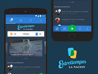
Entretiempos - LA NACION: Logo


I was in charge of the logo of Entretiempos and it was really fun. Especially because it took a huge challenge as I used Lobster as the main font :o
Obviously I made some arrangements on it and I can tell that it looks really nice.
This was an incredible project with the team. If you want to see more of this project, please come here.