Notabli Logo


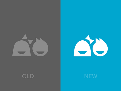
Working on an update to the Notabli logo. We love our mark, but it's showing some signs of age. The original was optimized and pixel-fitted for viewing as an app icon on a non-retina iPhone, hence some of the harsh angles. The refreshed logo is softer and a bit friendlier.


