Blood Glucose Trends


Breaking down large amounts of data into something that is graspable and easy to use is always a challenge. These graphs give a healthcare professional the ability to spot trends among hundreds of a patient's blood glucose readings. This project is a culmination of a lot of talented people working at Glooko. I was responsible for design and user experience.
"What do there crazy graphs mean anyway?" read on.
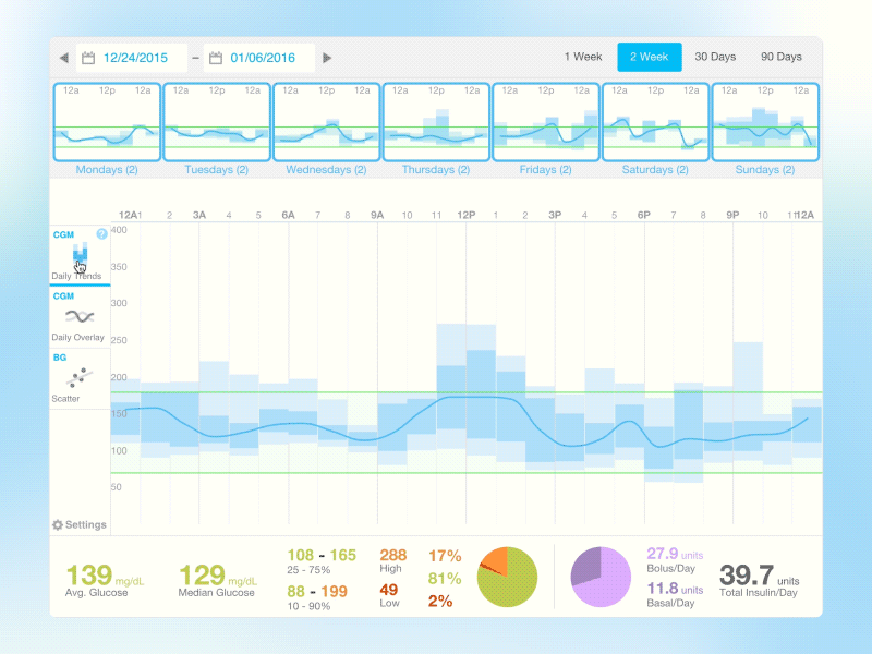
The main graph shows a 24hour day with a selectable time frame (one week, two weeks etc.) of data to overlay on top. The blue "Daily Trends" graph shows all this daily data aggregated into percentage blocks (ex. the dark blue block shows where 25 to 75% of blood glucose readings fell within a particular hour) with a blue median line running along the entire day. The colorful "Daily Overlay" graph shows each day as a separate color (ex. all Wednesdays are teal). The user can also see little preview graphs of each day of the week and use them to filter the data of the main graph.


