Personal Mark

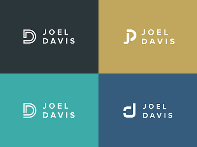
Been playing with a personal logo for some time and am looking for some feedback and critique. I'm not blessed with nice symmetrical initials, so this is more of a challenge in using the "j" and "d" letters.
Maybe I don't need a mark, but just a consistent typeface?
Feedback / critique / thoughts are appreciated and encouraged.


