Fearon Bros v2
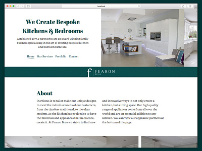
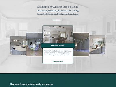
I was never 100% satisfied with the first version I designed for this site - I felt it the site should have a more classy, editorial feel to it. So from that:
- I stripped the colour palette back to just four colours
- Opted for Abril Fat Face for heading fonts, and Alice for my other text
- Went with a full fluid design rather than containing to a certain width
- Bigger imagery to highlight the great work of the client
- Two column text to fit the editorial theme
Will publish a full case study once the site has gone live.