Tori Torsion Photography (Logo)

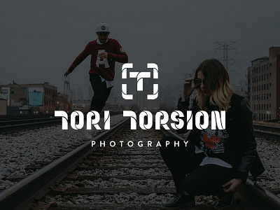
Logo for my buddy Tori "Torsion" Howard who is a dope photographer based in Chicago. Check him out @toritorsion on Instagram. That's his photo he took of my Winter 2015 lookbook shoot for Coursewrk Supply Co.
This is probably one of my favorite logo's I've done. The concept here started from his nickname Torsion which comes from his background of being a break dancer. With that in mind, I wanted the letterforms to reflect that name so I made them look as if they were twisting and contorting. This just so happened to also make the shapes within the letters look reminiscent of the shapes within an aperture shutter. That combination of visual elements is what makes this concept so fitting and true to who Tori is—a photographer and b-boy.
The icon is comprised of several letter Ts. There are two T's that make the one T in the center to represent Tori Torsion. The surrounding bracket-like T's make the shape of a focus within a camera viewfinder.
Again, check out his photos here: https://www.instagram.com/toritorsion/


