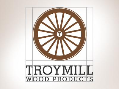
Wood Company Logo
Logo i'm developing for a wood products company. Their old brand has an Amish touch with a horse and buggy. I was hoping to to pay a small bit homage to the Amish and the metaphor of hard working, traditional and movement with the wagon wheel. Thoughts on the typeface. (extra lines are just showing how the logo balances it's self out) Please let me know your thoughts!!!! PLEEASE!
AJ :)
amish
balanced
brand
branding
brown
earth
green
hardworking
identity
mark
process
stationary
wagon
wheel
wood
wordmarkm
View all tags
Posted on
Sep 1, 2011
More by Arnaldo Jimenez (A.J.) View profile
Like


