CBINT Logo

Designed a new logo and brand system for Congregation Beth Israel Ner Tamid awhile ago. Had fun learning about their history and learning about the jewish community and their beliefs. I put a lot of thought and effort into this one.
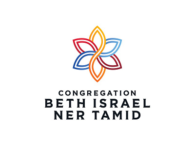
CBINT is a congregation that came together as one whole. There was a congregation called Beth Israel and another called Ner Tamid. Once they came together to form one congregation, they wanted a logo to represent that.
Since they were starting fresh with a new community coming together, I wanted to show that in some way. Instead of going with another star of David as a symbol of a jewish community, I went with a softer feel using leaves to play off of the saying "turning over a new leaf" suggesting starting a new, fresh chapter. Each leaf forms 6 different points, bringing in the subtle reference of the star of David.
Ner Tamid stands for an eternal flame or light. I used the symmetrical shape of the mark to connect the reflecting leaves to show an eternal symbolism. This also ties into community coming together and connecting as one. The center eternal leaf that points up and down represents the eternal flame.
Each color was picked from their stained glass inside the synagogue and the double line work stands for the 2 congregations coming together as one. The typography gives subtle nodes to Hebrew calligraphy, while still being readable and modern.


