Console Icons - NES

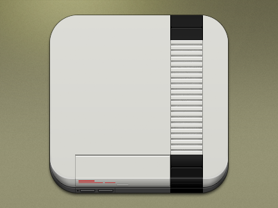
Part 3 of my series. I'm still not really happy with this one. Although I appreciate the simplicity of the design, I feel like it doesn't lend itself well to the icon itself. I experimented with a much bigger bottom bevel to make room for all the details on the front of the console, but the perspective looked awful. I'm not sure what I could do to improve this one. Critique would be super helpful! Thanks for looking!


