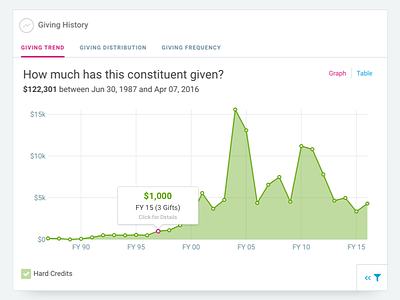
Donation History Report Card


We recently updated the donation history card on every profile in our application. Our focus for the update was to:
1. Simplify the UI in a way that brings clarity and focus to the data.
2. Tuck away filters in a way that power-users could access, but didn't clutter the visualization for most users.
3. Provide additional graphs without adding duplicate cards.
We decided to go with a tabbed navigation inside the card to easily click-through each report, along with a small filter button in the bottom right to reveal advanced filter capabilities. In addition, we created a minimal-style toggle button to switch between graph and table views helping to de-clutter the chart.
It was a super fun project thanks to the help of Julie Reitter on our front-end team.


