Julien Baker - Sprained Ankle LP (redesign)


After seeing the original cover art and listening to the album a few (many) times, I realized the art didn't do her music justice, so I tried my hand at a redesign. This was super fun to do.
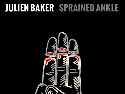
I chose the boy scout symbol because it stands for this ideal of the person, as kids, we think we're supposed to be... But perfection is impossible. The three fingers in the "boy scout sign" stand for three things: Honoring yourself, honoring others and honoring God. In her album, Julien touches on all of these subjects and her struggle with doubting herself, others and her beliefs... Often to the point of complete detachment and alienation.
The process was the best part... I illustrated the hand with a sharpie, then put gold leaf over some black construction paper. Finally I scanned both of them in and used the gold leaf texture as the outlines of the hand.


