Evolution
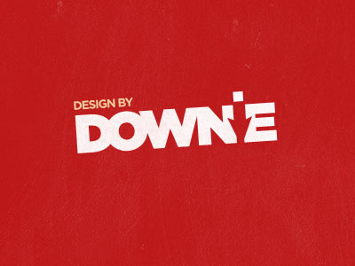
Due to the feedback received on the last version, I have simplified the logo.
I have gone for a slight new brand direction and drop the first name from the logo mark and make the font weight bolder.
I feel this is getting there now and looks a lot cleaner at smaller sizes.
View all tags
Posted on
Sep 25, 2011
More by Ryan Downie View profile
Like


