The Atlantic Article

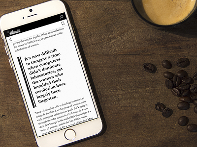

While I think The Atlantic's type treatment for their desktop and mobile web is top-notch, I wanted to play a bit with the subtleties of weight, size, and leading, especially the quote block. I added in the double line quote bar in there to harken back to the header separators in old print.
I used Baskerville, as this was a pure typographical composition, and with the elegant-yet-sharp book face of Baskerville, I figured it'd be fun to play with the contrasting weights and spacing.
Be sure to click on the attachment for a high res view of the full article treatment.


