VSCO Adjustments


Hey guys!
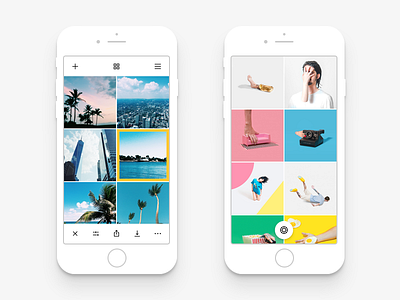
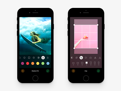
Today I am sharing a new little piece of VSCO Redesign I am working on. This time it's some other Adjustments screens. Particularly I wanted to design a convenient Crop screen, which you can see on the right. I also attached the light versions of the screens below so you can take a look.
With this little shot I wanted to point out the visuals that take place here. I tried many different versions to see which looks and works better for the app and I decided to go with iOS's identity, which is translucency or blur.
Each UI element you summon here uses the photo underneath it and either darkens or lightens the rest out, leaving the blurred contrasting background. Editing each photo would be a different looking screen because each photo is different in terms of colors it has on it. So I think it would be a nice touch to the app and would give more individuality to each photo.
I was also thinking whether I should somehow separate the upper and the lower row of icons in Adjustments screen. Tried many things like using the different-colored bars underneath each row, or using a thin line separator in between but after all the best choice was to get rid of any graphical complications. Simplicity is the key so I brought down the separators and now it looks a lot cleaner, yet it's very distinguishable.
Hope you're gonna like it and stay tuned for more updates and new shots about VSCO. Have a great day! 😜