A UI A Day — Day #5: Better Navigation

Little project I started. The idea is to try to come up with a simple solution for a daily problem with a UI/UX proposal.
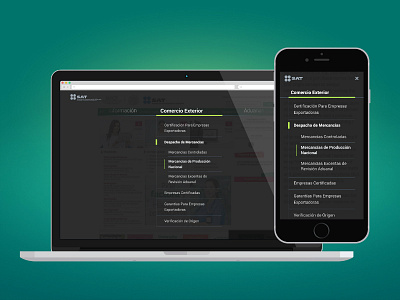
Recently, the Mexican Tax Administration Service came up with a series of digital services to make taxation processes much simpler for the regular citizen. There’s only one problem with that: Their website is a complete mess… a nightmare, basically.
No content engineering nor strategy has been applied to the numerous sections and services available. It’s not responsive at all and one of the most complicated things about it, is that the navigations everywhere on the website are so hard to understand.
So I came up with this very simple concept for an improved and organized navigation that would make it easier for the user to find the content they’re looking for regardless of the device they’re visiting from.
Of course this is one of the thousand improvements that could be done to the general experience for this website, but a clean navigation is always a great start.


