Accessible Sashes

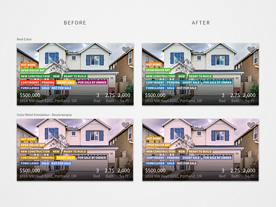
Attempting to simplify the colors used in sashes on our homecards.
Brought the number of unique hues from 6 to 4. Created a more clear system—Green is active, blues are off-market. Sashes between active and off-market (contingent, pending, etc.) are special in that they don't squarely fit in either camp, and the color attempts to reflect that.
My secondary goal was to make the colors more accessible. For full vision users color imparts meaning that can be understood at a glance, but our color-blind users weren't able to benefit from that. The new color scheme works almost as well to red-green color-blind users as it does to full vision users.


