Tubik Studio | Architecture Firm


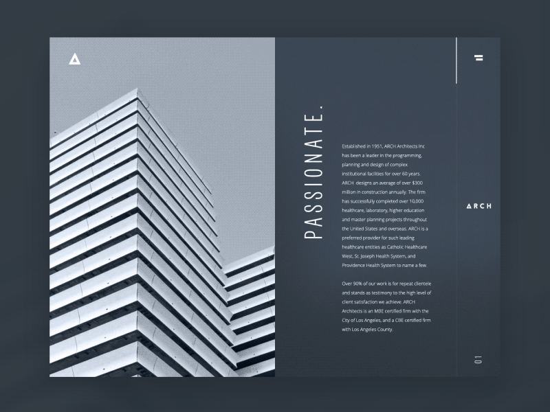


Hello friends! I have prepared a new shot to discuss with you today. This time it's a design concept featuring a website for architectural bureau following minimalistic and functional approach. The layout is accomplished on the basis of priorities in presenting this particular business field. Taking into account that the nature of the company activity is deeply visual especially in terms of presentation to new clients, I have selected the background and fonts that have to leave the immediate impression of style and sophistication. The key words brought out in capital letters become the integral part of stylistic concept being also informative and quickly setting the company ideas and approach to work. The visual effects are supported with smooth animation.
As well as in previous shot, I am keen to invite you to discussion. I would really appreciate if I could hear your opinion on some issues I am considering now in the domain of web design, in particular:
• What are your feelings about usage of headlines and/or other copy elements in vertical placement on the webpages? When do you find it acceptable and when does it seem inappropriate for you?
• Do you support the idea of using a hamburger menu/button in full-size webpages as a trick friendly to general minimalistic approach, not only in mobile versions, but in all the variants of website presentation on different devices?
Look forward to your opinions, guys, they are highly appreciated!
To share more ideas we get working on design projects and concepts in Tubik Studio, we regularly update Tubik Blog with new articles. The latest one is focused on the variety of landing page design concepts. Welcome to join!


