Mochila 1.1

Earlier this week we launched Mochila 1.1 to our users at 8 universities. The most notable change was the addition of a dark theme. Historically, I've been either against or ambivalent when it comes to dark themes. I don't use them, and I feel like they can sometimes be too simplistic and just be an inverse of the corresponding "default" theme. Plus, it seems like dark themes are always treated as second-class citizen because they generally aren't the default.
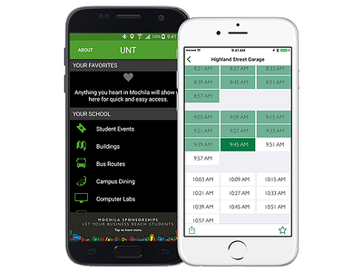
For Mochila's first big update, we decided to add a dark theme and as it turns out it was pretty fun to do! There are a few changes we've already made for a future bug fix release, but generally I'm pretty happy with how it turned out. We use a secondary color for each school, which in most instances is an ironically brighter variant of the school's color. In some cases, it's a more bold color such as this lighter and more neon green for UNT, or the yellow at USC.
Other new features include some great dining filters, to show you what dining options are available at a certain time of day, as well as quick actions for iPhone 6s users, and lots of improvements to making it even quicker to see what you need. Things like: Making bus stop pins red when they aren't running, showing computer lab times in pin popovers, and adding direct sharing. Take a look! https://mochila.co


