Hud Logo Option #1

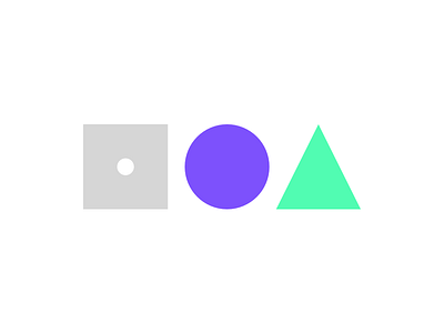
I'm revisiting the logo for gethud.com. The shapes are meant to represent the different UI patterns a library can contain. Shapes can be combined to form other shapes, much like how an interface is built.
This is one of the options I'm considering and fits well with the current brand. Check out the other two and let me know what you think :)


