Welcome Screens
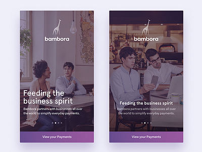
Some early ideas to welcoming our merchants. I was playing around with two different layouts. One with a larger typographic feel and one more traditional. Also exploring a subtle gradient map for our nice brand images shot by Megapixel.
What do you think; bold and left aligned, or traditionally centered?
Posted on
Sep 6, 2016
More by Mattias Johansson View profile
Like


