Diverse UI: Visual Redesign

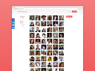
Last week I launched www.diverseui.com, a resource to find diverse user images to use in your designs.
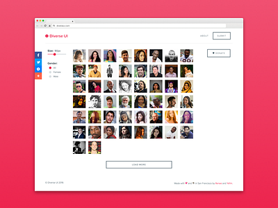
After the initial push to get the product out and completed, I took some time to go through a refine the visual feel. I primarily updated the font usage, button interactions, and submit experience (which was originally a mailto, will be getting it's own shot soon!). I want to take this from a tool that's just useful to a tool that's useful and exciting to use. This design is live at www.diverseui.com.
What improvements could I make? Specifically, are there any features or interactions you feel are lacking?
♥ If you're feeling the love, hit L and show it