VSCO Redesign


I use VSCO a lot. Remarkable filters aside, the user experience of the app is esoteric. Designer @Ilja Miskov has articulated some of the reasons why it’s terrible in his gorgeous work ( https://dribbble.com/shots/2808959-VSCO-Photo-Library ) and I really appreciated that.
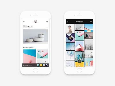
I tried to rethink and address some problems bothering me for a long time in VSCO. After analyzing the app thoroughly and reviewing the product vision aiming for community, I gave my version of VSCO redesign. Here’s what I’ve done:
1. Made obscure icons and weird symbols understandable.
2. Reformed UI elements in a more intuitive and organized way.
3. Adjusted the structure to encourage users to explore more content, which is in accordance with the official product vision.
4. Removed redundant and over-designed elements from the interface.
5. made former hidden key features visible for “what you see is what you use”.
Redesign turns to a self-gratification thing easily. Since blind to the data, the user feedback and even the product vision, we outsiders are designing in a vacuum. However, redesign provides the chance for us to notice and to dig deeper. The process of finding and tackling problems is a way of learning. That’s meaningful to me.
Hope you like it ❤


