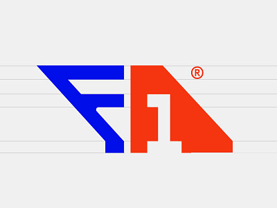
Formula 1
117/365 Days of Design – design something new every day in attempt to overcome perfectionism, improve my workflow and to master my craft.
F1 Logo concept
Using the shape of a spoiler/fin to embody a sense of speed and motion, while acting as a typographic piece. The F acts as a alternating racing road, and I've also used negative space with the 1 to break up the logo.
Let me know what you think?
http://tunstall.design
http://twitter.com/tunstalldesign
http://instagram.com/dom_tunstall
View all tags
Posted on
Sep 26, 2016
More by Dominic Tunstall View profile
Like


