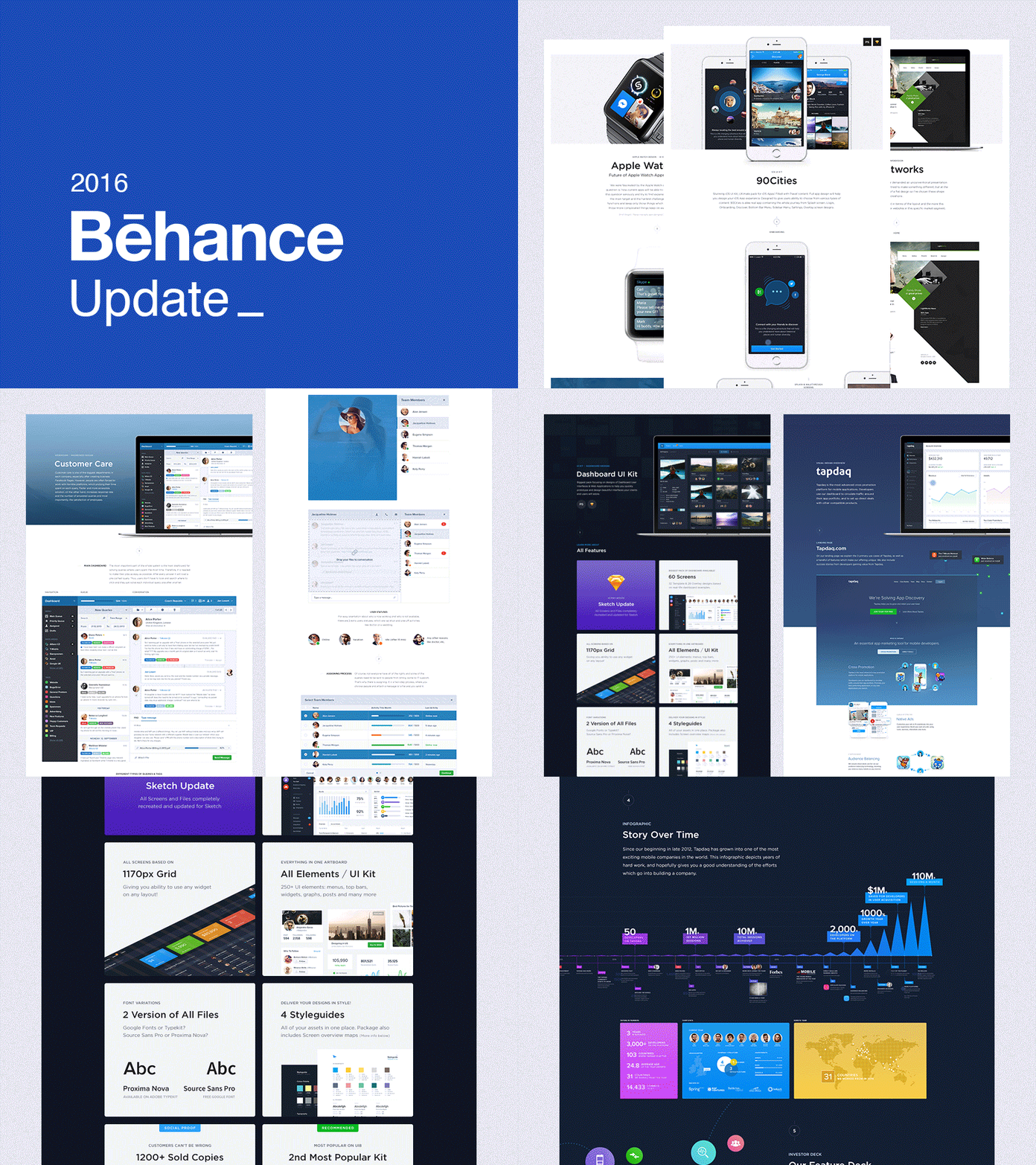
Behance / 2016 Update
Hi, it's me again. I've spent last 2 weeks redesigning and reorganising my Behance projects.
Link: https://www.behance.net/janlosert
Behance is one of the only ways how can you learn more about my designs and decisions so I've tried to aim for cleaner and more appealing and readable presentation of my works and UI kits / products.
The process was actually really tough. Working with my old design to fit the cleaner layouts I've tried to aim for. I've recreated all project previews to consistent grey background. Which works great to me, especially in the footer of every project. (Check attachment or the actual Behance).
Although a few projects stayed very similar only with text and font changes to fit the same style across the whole portfolio. I've used Gotham over Proxima Nova probably for the first time in past year and half.
Question for you: Which one do you like the most and which one do you think needs more polishing?
You can find all of them here: https://www.behance.net/janlosert
--------
Learn More About my Design Process - https://medium.com/sketch-app-sources/26-steps-of-product-dashboard-design-c97af84c4146#.nfjs2vwdr


