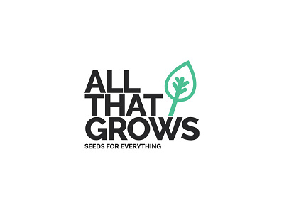
ATG - Branding
This is us creating a brand identity for All That Grows - a seller of pure, heirloom, traditional, non-GMO, and pure seeds. The designer behind this wanted to create an iconic identity that wasn’t too graphic nor too real but one that makes brand recall easy, memorable, and lovable :) (if possible!). It was this that they came up with a minimalist rendition of a leaf that realistically represents brand value, brand identity, and the company’s niche. The leaf branching out of the ‘W’ is representative of the plant growing out of the soil. The font used here is bold raleway font which lends the logo a remarkable presence and makes it a standout.
The packaging also is representative of the earthiness that this brand proudly displays. Hope we did a better job of it, the client is happy! But do tell us what you think.


