Web App - WIP

It's funny how simple UX can look, but behind the scenes as I work through the process and investigate a product's potential flow and consider the user's needs, I begin to uncover solutions that help elevate important aspects of the product.
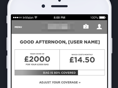
This snapshot showcases a simple dashboard that had previously stated the monthly cost of a service, but what was missing previously was a visual representation of what that cost impacted in the user's insurance coverage.
The decision to up the coverage is made more clear by allowing a user to know that their decided monthly payment only gets them so much coverage. 80% visualized as a bar began to make concrete the idea that that part of the insured items would be left out of the picture. One of those moments that hit me like bricks and answered my feeling that *something* was amiss that the user would need to grasp the product better.


