Ozan - New Logotype Anatomy


Bolder, stronger and simpler.
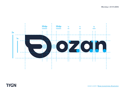
We have updated our logo to emphasise our tone. While creating the logotype, we have utilised curves to be compatible with our typeface. Adding the wings was an issue since it wasn’t the best for resizing because it was creating anti-aliasing problems. So we have positioned the wings as a part of our logotype only with one edge and achieved the perfect harmony.


