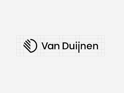
Simplified logo build-up

So this is the buildup for the Logo I did for Van Duijnen.
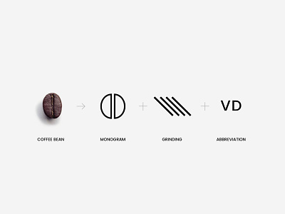
It's basic shape is derived from the coffee bean, the 'VD' abbreviation of 'Van Duijnen' and it's diagonal lines reflect some of the brand's heritage.
Full project "here