Zeplin Redesign WIP

Hey there,
I’m currently working on a personal redesign project for the native Zeplin Mac app. The app is something I use pretty much everyday and I really like it, there were only a few things I would change regarding layout (very minor), visual style (mostly) and Quality of Life (usability and interactions, something like keyboard shortcuts and tap target sizes).
Since Zeplin is a niche product and I’m a huge part of the target audience I felt very comfortable with decision making most of the time (doesn’t mean I didn’t make a wrong turn here or there) and I also gathered feedback from developers I work with, as to have it founded on research as much as possible.
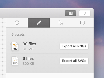
I’ll write about the WHY seperately, as Dribbble isn’t the right medium to convey all the deeper reasons for changes. For now, I’ll just show you a tiny screenshot of the detail screen export tab as a teaser.
I love projects like this because it is very constricted (not freemium, very specific target audience, very specific use case) and it's not based on totally unreasonable requirements, which would never happen in the real world (I'm looking at you Facebook and YouTube redesign concepts).
There isn't much to critique yet, but feel free to drop me a line about whatever – I'm a terrible icon designer, I know, I'm working on it ;)


