VSCO Profile


Miss me? It's been a long time.
I am back with updates on my VSCO Redesign Concept. Many of you liked it and gave me a really nice feedback, so I'm taking a chance to say thank you all for your support! This redesign concept is definitely something I am considering as my own baby, something that's drastically improved over the original app that VSCO introduced.
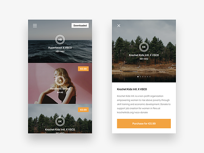
And today I am happy to bring you some new stuff for showcase. I'm basically getting finished with the project. The only things that are left were the actual VSCO screens. If you are confused, let me tell you that VSCO is not only a photo-editing app where you add filters for your pretty Instagram shots. It's also has a social aspect, I would even say a mini social network inside. Each person gets a VSCO Profile where he can post some beautiful photography. I'd say it's like a little portfolio for photographers right inside the app.
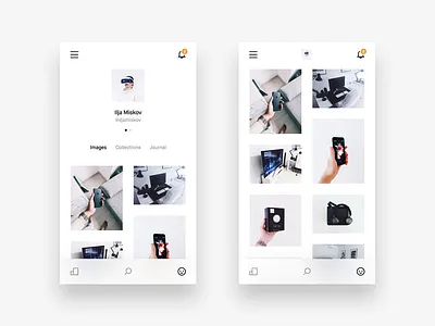
So I'm starting with the Profile screen. I was thinking of a better navigation for the whole app, and I really didn't want to mix the editing space and the social space aspects of the app. So what you are seeing here is not in any way connected to the Gallery screens, Filter and Editing screens, Store screens and stuff like that. And so it's a completely different space, I was able to experiment with the navigation and bring the best out of it. You have three tabs at the bottom: Feed, Search and Profile. Each has a different interface and will be posted on Dribbble soon. At the top you have a place where you access all of your VSCO notifications from any of the three tabs. And of course a menu icon from where you can access any of the app screens, like your Library, Camera, Store, Settings and so on. And this is the only way to get in our out of here.
I tried to make the profile card itself to look super clean but yet have the same functions that the current VSCO app has. When you scroll your photos, your profile card gets shrunk with a nice transition, where your profile image smoothly gets on the top bar while the rest just fades away.
The photos grid was intentionally made to be different sizes and to have paddings so it would look different from a blocky/squary Library grid, as it's your editing area.
I also made a dark version that looks super awesome on a black iPhone. You can see it for yourself.
Hope you'll like this and stay tuned for new updates 👊
Follow me on Twitter
Follow me on Instagram
PS: And again, the hero of the dark interface today is @Tobias van Schneider ▲▲▲ 😊