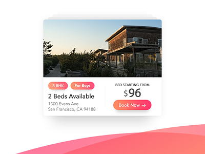
House Preview Card

Gradients are soothing and IMO are a good option for CTA's.
Brainstorming with UI is fun.
About the shot: A preview card for house renting. It goes on the landing page where a user can preview the primary info. necessary to start booking a room or house in the first place.
Book now takes the user to the house info. webpage.
Note: It can go with destination booking websites as well. Also, gradients look good on websites where the service is emotionally attached to a user and vice-versa.
Do share your feedback on this.


