Workout Screen


One of my current projects is a redesign of a client's app that houses content such as workout programs and meal plans. It's proving to be a great challenge for me.
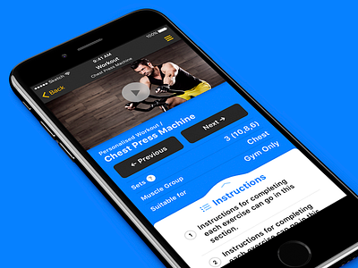
One of our main goals is to increase users' engagement with the app by presenting the content in a more immersive manner than the current release, which you can check out in a comparison in the attachment. (I've replaced imagery and some content for confidentiality reasons.)
To achieve this, I've made the instructional video more prominent since it's so vital to the experience. Incorrect taps can be an issue in a busy gym environment, so the addition of previous and next workout buttons provide a way to cycle through workouts without having to return to the main navigation. In general, tap targets are larger and all elements have been given a little more breathing room.
Typography wise, we'll be using San Francisco on iOS and Roboto on Android to enhance the native feeling of the apps. These typefaces have more consistent line weights than our current choice and perform better at smaller sizes, not to mention the horizontal space savings their narrower characters make.
I'll be building this in HTML and CSS so animations and gestures have been kept to a minimum.
I'd really love your thoughts on this and any feedback would be awesome. I'll be posting more of this project as it progresses and I get the necessary go-aheads ;)


