Desktop Settings Screen

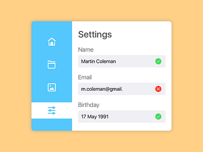
Designed a simple settings page for day 7 of the Daily UI challenge.
On the surface I think it turned out rather well, but overall I'm not happy with how I got here.
I believe a design should serve a purpose. It should have context. There should be a story. All elements must have meaning. This should guide you to design something around these "constraints", and ensure your design serves the purpose of the overarching application in the best possible way.
Antoine de Saint-Exupery once said that "Perfection is achieved, not when there is nothing more to add, but when there is nothing left to take away", but since none of my elements serve a purpose, true perfection would in this case be a blank 800x600 picture. Why does it need your birthday? Where does the picture icon on the side go? How did the user get here and why?
My design is inherently flawed, and no border radiuses or pretty colors can make up for that.
As such, I don't feel I'm learning as much as I could doing this challenge. I need to learn how to design for a purpose. How to use colors, shapes, images, whitespace, text, etc. to deliver a message, make something clear, obvious, usable, etc. Not how to throw shapes and colors together and hope for the best.
This is not me throwing in the towel. I'm excited for the next 93 days. I'm just going to have to put a little more thought into these designs before I begin them.


