


Calendar View and Status

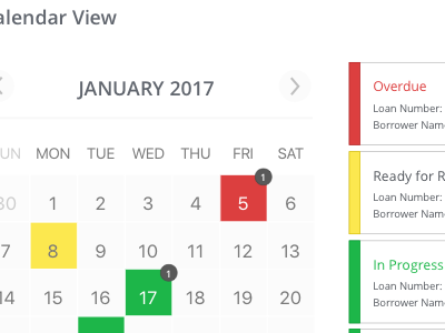
I re-designed the UX/UI for a portal where the user had to service an influx of customers, each at varying stages in the service process. The main question was: How do we present the incoming customers in a way that makes it easy for the user to assess what has been done vs what needs to be done?
I reflected back on my experience in a call center and remember all the time and mental energy it took to prioritize my queue. I created this calendar view so the user could have a visual method of seeing what deadlines are coming up. The original portal only showed red statuses for deadlines that were overdue. Instead of having a solely penalty-based experience, why not add two more statuses? Yellow for deadlines that are coming up and then green for "healthy" customers. You can quickly cut down the time it takes for a user to mentally organize their queue and figure out which one needs attention first.


