Statistics

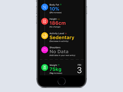
Have been exploring (with, honestly, limited success) ways to display fitness data in a meaningful, insightful manner. The data is entered manually by users, meaning we often end up with gaps in the data making it very difficult to create useful graphs. The solution to this problem probably requires more thinking around the actual data entry process, and how we can incentivize users to enter data accurately and often.
Anyway, what you see here is a daily view of the data that's been entered. We probably won't be using this iteration, so I thought I'd just share it here. Icons are placeholders from the Noun Project.


