Alluvial - IBM Design Language Data Vis Animation


Analyze IBM’s design heritage to inform the future and extract a shared vocabulary of stylistic choices, visual patterns, color combinations, and composition principles.
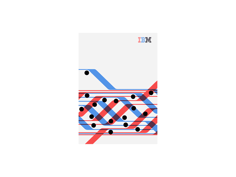
The IBM Alluvial Diagram communicates patterns and trends over time. It overlaps different layers of information represented in bold hues as graphic shapes.
Multiple flows can show how different categories evolve over time. Circles can be a second indicator which add another layer of information. Reduce the layers overlapping to fewer than five when possible, aiming to remain clear and readable.
Check out the new IBM Design Language data visualization guidelines here: http://www.ibm.com/design/language/experience/data-visualization/
Original poster design: HORT & Carl De Torres for IBM Software campaign
Alluvial Diagram: Accurat & IBM Design Language
Storyboard + Animation: Evan Maeda


