ParentVUE Gradebook

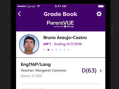

For this screen, I really wanted to call out the most important thing to parents…the grade. Each subject's grade is presented in a clear way at the end of each row allowing parents to quickly scan their child's overall progress. Other information such as the teacher's name or the room assignment is secondary information.
The navigation has also been changed from a segmented system in the current design to a swiping paradigm, where the user swipes the screen to change the quarter (i.e. MP1 swipes to MP 2). I realize that swiping might not be entirely familiar to a lot of older parents, but the small segmented buttons for each quarter in the current design were even worse and harder to control with such tiny tappable areas.
Lastly, some redundant information, such as the sharing actions, the child's grade and the numbered lists, have been removed altogether or moved to different screens to increase the free space even more within the overall design.


