Primalkip Logo

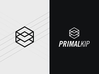
This is a logo I created for a crossfit app called Primalkip. It's a minimalistic design that may be considered a little played out but it so accurately represented the business. First off it's meant to look like a cube or box because crossfit gyms are called boxes. Secondly, the app is being designed to meet the needs of athletes, trainers, and box owners which are represented in the three layers of the box. The symbolism was just too sweet to not go with this design. Hope you enjoy!


